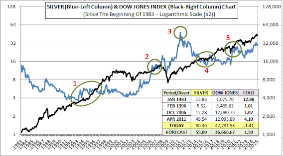
Here is the logarithmic scaled chart of Silver compared with the Dow Jones Index since the beginning of 1983.
There is a 10-fold price difference between Gold and the Dow Jones Index. Pay attention to the left and right columns of the chart above; there is also a 1000-fold price difference between silver and the Dow Jones Index.
The circles 1, 2, 4 and 5, those are marked in green colour, show the areas where this 1000-fold difference occurs exactly. In other words, for example, in February 1996, which is in the circle number 1, silver was at $5.5 and the Dow Jones Index was at $5,500.
In January 1983, silver was exactly 12.88 times more valuable than the Dow Jones Index. But then between circles 1 and 2, silver's return fell below the Dow Jones Index, and there happened a difference of almost 3 times against silver.
In circle number 2 - corresponding to October 2006 - the Dow Jones's and silver's return became equal one more time.
Silver climbed to its highest peak on the date April 2011 and the highest value of silver reached to $49.54, as you can see in circle number 3. The Dow Jones Index was at 12.094. There was a 4.10-fold difference between them in terms of return.
They became equal again in the green circles numbered 4 and 5. Today, the price of one ounce silver is $30.40 while the Dow Jones Index is at 42,732. The return of silver is 1.41 times, or in other words, 41% below the Dow Jones.
I am making my first prediction about the future price of silver here. In my opinion, in the year 2027, the Dow Jones Index will decline a little according today's value while silver reaches $55; 1.5 times higher than Dow Jones in terms of return.
Current chart is a very special one. Here we have the opportunity to see the data in the previous chart, in a much simpler and easier way to understand.
This Silver/Dow Ratio Chart is created starting from the beginning of 1990. The green circles numbered as 1, 3 and 5, show the periods when silver and Dow Jones Index returns were equal. In other words, the value of Dow Jones was exactly 1000 times the value of silver in these dates.
Circle 2 indicates the date of the Dow Jones Index's greatest increase relative to silver, that is May 2001. There, the Dow Jones Index's return - shown with a minus sign - exceeded silver's return by exactly 2.59-fold. In April 2011, this time, the return of one ounce silver folded the Dow Jones Index by 4.10 times.
In the previous chart, I had announced my initial estimate for the price of silver as $55. Now, for some later date, I would like to express my estimate of $90 per ounce of silver. For this to happen, the return of silver needs to be twice the return of the Dow Jones Index.
I think this is a very reasonable target.


No comments:
Post a Comment