1/31/2025

Silver Amount, Reserve, Life

      If you pay attention to the table below, you will find data on reserve amount, production costs and how many years of silver reserves remain in the earth's crust.

It is estimated that the amount of silver those had been mined since the beginning of history is roughly 1.74 million tons. However, silver is a metal that is lost to a great extent due to reasons such as corrosion and because it is not considered worth recycling. Therefore, it is estimated that there are around 770 thousand tons of silver in existence today.


The cube on the side, which is 55 meters on each side, represents a value of 1.74 million tons because the density of silver is 10.5 grams per centimeter.

According to the expected demand amounts for 2024, the largest demand for silver comes from industry with 58%, followed by jewelry and silverware with 21% and investment use with 17%.

Annual silver production is only 25,830 tons. There is a gap of 12,088 tons with demand. This is a very high figure. The four-month strike in Mexico was the main factor in this gap. Last year, part of the difference was covered by recycling efforts, and the other part was covered by the stocks of mining companies.


It is also understood from the high industrial demand; the demand for silver has been in a steady upward trend in recent years - as can be seen in both graphs. As a result of both this development and the fact that silver production remains below demand, it is impossible for the price of silver not to increase in the coming years.


     Silver production costs are also increasing along with silver demand, reaching $17.18 per ounce by 2023. The market value of silver is currently 77% higher than this cost.

     The world's proven silver reserves are around 550,000 tonnes. This means that if current production figures are maintained and no new reserves are found, the silver in the earth's crust will be depleted within 21 years.


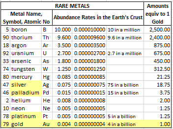
     I have also shared the Rare Minerals Table in our gold publication. I would like to use it here only to compare silver and gold. Gold is 18.75 times rarer than silver.

How to Mine Precious Metals?


     The first row of the table above is showing the amount of precious metal in ppm, that is parts per million, or milligrams per kilogram of soil.
     
     Let's elaborate this subject a little. If you sift 1000 tons of soil you step on without losing anything, of course, on average, you will obtain 75 grams of silver, 15 grams of palladium, 5 grams of platinum and only 4 grams of gold from these 1000 tons of soil.

     Of course, such a method is neither economical nor possible without any losses.

     Therefore, in order to mine any metal, ores with concentration levels 100 to 1000 times higher than normal must be found.

     Precious metals are not visible to the naked eye in most cases. In order to get visible to the naked eye, they must have a density of at least 30 ppm.
  
     Therefore, geological surveys and feasibility studies are carried out. It is evaluated whether the project in the region where the ore is detected is economical or not, and only then mining activities can begin.

     For this reason, the rates of precious metals found in the earth's crust and the proven reserve amounts may not be consistent with each other. It is certainly possible for reserve amounts to grow over time, but these reserves can never exceed a certain percentage of their rates in the earth's crust.

     We should examine the second row of our table in this context. The PGM expression you see here means Platinum Group Metals.

     The PGMs are platinum (Pt), palladium (Pd), rhodium (Rh), ruthenium (Ru), osmium (Os), and iridium (Ir). The six metals are often found together, but their relative abundances can vary considerably.


US Inflation Adjusted Silver Charts

     In the charts below, logarithmic scale is used and silver prices are adjusted backwards according to the US inflation.

     First chart is formed from January 1983 till today. When inflation adjustment is applied, the price on this date rises to 44.68. The lowest price was on the November 2001 at $7.43, and the highest price was on April 2011 at $70.39. Today's price is at $30.40.

     There are two important resistance levels for silver. One is the nominal peak which is at $49.54 and the second one is the relative peak that is the inflation-adjusted equivalent of this historical peak which is at $70.39. Only after these levels $90 can be targeted.


     Our last chart is the US Inflation Adjusted Silver Chart, which was created on a logarithmic scale again from the beginning of 2016.

     I mentioned that we have targets of 50-70-90 dollars. The 2011 value that we see here as $70.39 will continue to increase with the US inflation that will occur in the coming years. Therefore, when the current peak of silver is equalized with this past peak again, perhaps 80 dollars will be reached.

     In such a case, rather then waiting for $90 or higher, selling could be a better strategy, of course by evaluating other data.


How Does the Price of Gold Get Affected When the US Prints Dollars and Increases Its Debt?

 The Effect of Dollar Supply and US National Debt on Gold Price

     In this section, we will examine the effects of the US dollar printed (i.e. the amount of emission) and the US National Debt on gold pricing.


     In the chart above, we see the picture of the dollar supply over the last seventy years. It can be clearly observed how the momentum increased after 1995 and especially after 2008. Probably the recent decline in the money supply nowadays will not last long.


     This chart created since 2012, compares the gold price level according to the dollar supply. The low rate shows that there is an opportunity for gold to rise. There has been an upward momentum since September 2013, but there may still be a long way to go.


     It can be understood much better when we look at the chart created since the beginning of 1950 that the ratio of gold price to dollar emission is still close to the bottom points.


     Another important indicator for gold prices is the level of the US National Debt. As it can be seen from the chart, a big increase has occured at the beginning of the pandemic.
     
     The US is not contented with just printing dollars, it is also borrowing at large rates that will double this effect. The US is the most indebted country in the world in terms of size and one of the most indebted countries in the world in terms of its ratio to GNP.


     In the table above, we see the connection between US National Debt and the price of gold. An increase in the Gold/Debt Rate means that the price of gold is getting cheaper and a decrease means that it is getting more expensive.
     In 1980, the ratio was 1.32 and gold was very expensive. In 2000, it reached to 20.40, meaning that gold became very cheap. Today, we are at the rate of 13.76.
     Now it is a suitable moment for me making some forecasts.You can see these, for the year 2027 in the last three lines.
     If the gold-to-US National Debt ratio drops to 10, this means that the price of gold will increase to at least $4,918. If this ratio drops to 7.5, the ounce price of gold will increase to $6,558, and if the ratio drops to 5%, it will increase to $9,837.

1/30/2025

Comparison of SILVER with DOW JONES Index

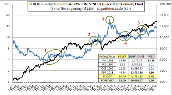
     Here is the logarithmic scaled chart of Silver compared with the Dow Jones Index since the beginning of 1983.    

     There is a 10-fold price difference between Gold and the Dow Jones Index. Pay attention to the left and right columns of the chart above; there is also a 1000-fold price difference between silver and the Dow Jones Index.

     The circles 1, 2, 4 and 5, those are marked in green colour, show the areas where this 1000-fold difference occurs exactly. In other words, for example, in February 1996, which is in the circle number 1, silver was at $5.5 and the Dow Jones Index was at $5,500.

     In January 1983, silver was exactly 12.88 times more valuable than the Dow Jones Index. But then between circles 1 and 2, silver's return fell below the Dow Jones Index, and there happened a difference of almost 3 times against silver.

     In circle number 2 - corresponding to October 2006 - the Dow Jones's and silver's return became equal one more time. 

     Silver climbed to its highest peak on the date April 2011 and the highest value of silver reached to $49.54, as you can see in circle number 3. The Dow Jones Index was at 12.094. There was a 4.10-fold difference between them in terms of return.

     They became equal again in the green circles numbered 4 and 5. Today, the price of one ounce silver is $30.40 while the Dow Jones Index is at 42,732. The return of silver is 1.41 times, or in other words, 41% below the Dow Jones.

     I am making my first prediction about the future price of silver here. In my opinion, in the year 2027, the Dow Jones Index will decline a little according today's value while silver reaches $55; 1.5 times higher than Dow Jones in terms of return.

     Current chart is a very special one. Here we have the opportunity to see the data in the previous chart, in a much simpler and easier way to understand.

     This Silver/Dow Ratio Chart is created starting from the beginning of 1990. The green circles numbered as 1, 3 and 5, show the periods when silver and Dow Jones Index returns were equal. In other words, the value of Dow Jones was exactly 1000 times the value of silver in these dates.

     Circle 2 indicates the date of the Dow Jones Index's greatest increase relative to silver, that is May 2001. There, the Dow Jones Index's return - shown with a minus sign - exceeded silver's return by exactly 2.59-fold. In April 2011, this time, the return of one ounce silver folded the Dow Jones Index by 4.10 times.

     In the previous chart, I had announced my initial estimate for the price of silver as $55. Now, for some later date, I would like to express my estimate of $90 per ounce of silver. For this to happen, the return of silver needs to be twice the return of the Dow Jones Index.

     I think this is a very reasonable target.

1/28/2025

Running Out Dates, Extracted Amounts, Reserves, Costs of Rare Metals

     Pay attention to the table below. The total amount of gold ever mined on earth till today is 212,582 tons. 17% of this amount is in Central Banks, 45% is in jewelry, and 22% is used for investment purposes.


    Proven reserves are approximately 59,000 tons. That is 27% of the total amount of gold ever mined. Annual gold production is 3,680 tons. As long as these production rates are maintained and new reserves are not found, the amount of unmined gold in the world will fall to zero in 16 years. This fact is the most important indicator of why gold will rise in the medium term.

    The second reason is the increase in gold production costs. Gold production costs have been increasing steadily since the first quarter of 2016. And today they have reached $1,450. The market price of gold is currently 1.82 times higher than its cost.

     While inflation is a factor in the increase of costs, another important factor is that gold is now being extracted from more costly and less accessible mines. In other words, gold extraction costs may increase geometrically in the coming period. This realization will naturally push the price of gold much higher.


     In our current table, we see the ratios of rare minerals in the earth's crust. The abundance and economic importance of boron and thorium minerals in Turkey are debated. However, the total amount of these two minerals is much higher than other rare minerals. Boron and thorium are found in the earth's crust at approximately 10 parts per million. However, the gold ratio in the earth's crust is only 4 parts per billion. In other words, boron is a mineral that is 2500 times more abundant than gold.

     Uranium is 675 times more abundant than gold, silver 18.75 times more abundant, palladium 3.75 times more abundant, and platinum 1.25 times more abundant. Gold is a very rare mineral, and there is only 16 years of unmined gold left. If gold doesn't gain value, which one will?

Platinum and Palladium Reserves, Lifespan, Quantities Mined (PGMs)


     While platinum is a shiny silvery metal, palladium is slightly darker and has a gray tone.

     Again, platinum is denser and heavier than palladium. In fact, as you see above table, platinum is the densest and heaviest among the four precious metals.

     While gold has a density of 19.50 grams per cubic centimeter, platinum has a density of 21.45 g/cm3. The densities of the others are in the table.

     This density can be expressed on a volumetric and larger scale as follows: 100 tons of gold has a volume of 5.13 cubic meters, while 100 tons of platinum fits in a volume of 4.66 cubic meters. However, the same amount of silver requires a volume of 9.52 cubic meters, which is nearly twice then platinum.

     In the third row, there are the amounts of these four precious metals, which we can call the “Four Horsemen of the Apocalypse”, that have been mined on earth to date. You must have noticed how little Platinum and Palladium have been mined since the beginning of history, with amounts of around ten thousand tons each. We will talk about the reasons for this a little later.

     The analogy of an Olympic pool is often used for these precious metals. When we consider it from this perspective, we understand that the amount of platinum currently mined would only fill 14% of an Olympic pool, while palladium would fill 18%. Palladium is mined less, but it takes up more space because its specific gravity is almost half that of platinum.

     The amount of gold mined so far can fill about 3 Olympic pools. For silver, this amount is equivalent to 44 Olympic pools. However, since silver is a metal that has not been recycled to a large extent in history and has been lost due to reasons such as corrosion, the amount of silver currently found on earth can be reduced by half, to 22 pools.


     The first row of the present table shows the amount of precious metal in ppm, that is parts per million, or milligrams per one kilogram of soil.

     We should examine the second row of our table in this context. The abbrevation of PGMs means Platinum Group Metals.


     The PGMs are platinum (Pt), palladium (Pd), rhodium (Rh), ruthenium (Ru), osmium (Os), and iridium (Ir). The six metals are often found together, but their relative abundances can vary considerably.

     Since they are found together, their production in the mines also occurs simultaneously. Therefore, the reserves are given collectively as PGMs, not separately for platinum and palladium. The total known PGMs reserve is around 70,000 tons.


     As you can see in the last column of the current table, most of the world's PGM reserves are in the Republic of South Africa. The total reserves, which appear to be 71,000 tons worldwide, are estimated to increase to 100,000 tons after possible discoveries in the future.

     When we look at the production figures, it is understood that the annual production of Palladium in mines alone, excluding recycling, is 190 tons and the annual production of Platinum is 171 tons. The annual production of gold and silver is much higher than these two metals.

     We know that platinum is one-third of palladium in the earth's crust. Considering today's production figures, it can be said that platinum has a lifespan of 83 years and palladium 225 years. These numbers correspond to 16 years for gold and 24 years for silver.


1/27/2025

PRESENT & FUTURE OF SILVER - XAGUSD - JANUARY 2025


     Black colour is gold and blue colour is silver in this dollars per ounce chart. If you pay attention to the left and right columns, you will see that gold is about 100 times more expensive than silver. You can remember from the previous gold post that the Dow Jones Index was also about 10 times more expensive than gold.

     This expression of “expensiveness” does not express the value, but it offers us a comparison opportunity in the long-term perspective. In other words, you can evaluate these "ten" and "a hundred"-fold rates as a midline. When the difference of prices go up, the probability of going down increases, and when the difference of prices go down, the probability of going up increases.


     In this context, I extended the previous chart by scaling it logarithmically and starting from 2016 till to 2028. I also added trend lines for both gold and silver. The gap between these two lines can be thought of as the midline. As you can see, when it goes up, the probability of going down increases, and when it goes down, the probability of going up increases. The 2027 year-end targets of $4,000 for Gold and $40 for Silver represent the lowest possible values ​​for these two metals, in my opinion.
So, when the new market prices are occured in the next three years and the gap on the chart is filled, the trend lines will also raise their heads higher. I will try to explain why I think so in the following charts and tables.

     But first, let's go back to our first chart. In March 2020, when the pandemic hit very sharply, silver's return fell below gold. Then, in just one year, it rose 2.5 times from bottom to top, reaching $30. Due to this early peak, it could not recover for four years and could not exceed $30.

     Both gold and silver started to rise again in September and October 2022 and still continue to maintain this upward momentum today. During this period, gold increased by 66% and silver by 73%. They are 4% and 13% below their peaks, respectively.

     But what we need to pay attention to is this: How are they in parallel movement with each other, right? This is not the case for platinum and palladium, for example. Sometimes one sometimes the other jumps, while the other remains stationary.


     In this new chart I created logarithmically starting from the beginning of 1990, the rising and falling trends of gold and silver, which are compatible with each other, can again be observed very clearly.
Silver had a slight advantage until the beginning of 2011. Since then, gold's return has come very close to catching up with silver.

     Silver's movements are more sharp than gold, meaning it is a more volatile instrument. Gold is relatively more stable.


     Our current chart is the Gold/Silver Ratio Chart created since the beginning of 1990. Declines indicate that silver is becoming expensive, and increases indicate that gold is becoming expensive. This is a chart used in the market. It is also compatible with our previous chart. In this previous chart, we saw that gold and silver returns approached each other after 2011. This is the reason for the recent increase from 2011 to 2025, that is shown with the orange arrow in this chart.

     Now let's take a closer look to the bottom and top values ​​indicated by the numbers 1 and 2.


     I had said that silver becomes expensive when the Gold-Silver Ratio drops to the bottom value indicated by the number 1. The peak value of silver on this date, April 2011, was $49.54. Gold, shown in red on the chart, was around $1450 on that date. In the following process, silver falls to $26.07 in five months. Gold, on the other hand, sees $1920 in the same period, September 2011.

     As you see, the Gold-Silver Ratio works well because in five months, silver lost 47% of its value while gold gained 32%.


     The number 2 was showing that silver's price has been cheaper. Now we look at this chart. The movement lasted only five months again. Gold actually rised in this range with a significant rate of 46.72%. However, silver climbed like a rocket with a return of 156%. The Gold-Silver Ratio has worked once again.

PRESENT AND FUTURE OF GOLD - XAUUSD - JANUARY 2025


While almost all investment instruments gained value from the beginning of the pandemic until September 2023, the price of gold remained stuck between $1700-2000.

From this date onwards, its rise begined and has provided a return of 38.26% in dollar terms to date. In September 2024, the ounce price of gold reached its peak at $2805.40. Today, it is 5.91% below this value. We will understand what will happen in the future from our upcoming graphs.

What did gold do while the Dow Jones Index increased sixfold from 8,000 to 48,000 since the beginning of 1972? Now let's look at this chart. This chart, which is important in terms of predicting the future of both, uses a logarithmic scale.

The black color represents one ounce of gold, and the blue color represents the Dow Jones Index. Notice the green circles.

The first circle is in September 1980. Gold outperformed the Dow Jones Index by 6.80 times during this period.

From this date to December 1994, the price of gold fell and the Dow Jones Index rose. On this date, shown as the second circle, both returns were equal.

The third circle is in January 2000. While gold's decline accelerated, the value of the Dow Jones Index increased, and the Dow Jones Index reached a price 4.15 times higher than the return of gold.

There is a great lesson that gold investors should learn from this. The rise is never permanent. When good returns are achieved at certain times, selling and moving to other investments is very important. Indeed, we see that gold investors lost money in the twenty-year period from 1980 to 2000. It's a long period and also the amount of loss is quite high. The importance of creating investment basket is obvious. You can change the portions of the basket you create, but never stick to a single investment instrument.

In our fourth green circle in December 2008, gold and Dow Jones Index returns are equal once again. After that Dow Jones Index return exceeds gold. Today, the difference between them is 1.62 times. This means that Dow Jones Index provided 1.62 times better return than gold.

I am making my first prediction about the future price of gold here. I think that in the near future, the return of black gold will be at least 1.5 times higher than the return of blue Dow Jones Index. In this context, Dow Jones may fall to 36,000 and the price of gold may reach 5,500 dollars.

My second prediction is seen in our current chart. This chart is a very special chart. Here, the return of gold is proportional to the return of the Dow Jones Index. It gives us a much better picture than our previous chart. The peak of gold, marked with the number 1, was in September 1980 and the bottom of gold, marked with the number 3, was in January 2000.

My first prediction for gold was $5,500 in the previous chart. My second prediction for a more distant future is that, the return of gold could exceed the return of the Dow Jones Index by two times. If this happens, the price of gold could reach $9,000 per ounce while the Dow Jones Index stays at $45,000.

How do I claim this? We will see this in our next charts.

In this context, our first chart is our logarithmic US inflation adjusted gold chart from the beginning of 1972. The correction has been applied backwards. Therefore, gold's 1980 peak rises to 2,644 and its 2011 peak rises to 2,695. The bottom point in 2000 is $465. Gold price tries to exceed $2,700 per ounce for the last 15 years.

This upward effort of gold can be seen much more clearly in the new large-scale chart created since 2006. The lows are now higher than before and the highs are now much more tightly confined. The previous low was 1396 and the last low was 1718. Once $2700 is definitely broken, it should not be a surprise to see $3,000-$3,300 levels in a short term.

Warning

Warning