3/27/2025

The Rankings of Countries by Real Dollar Value and Economic Performance - March 2025

      The first table below shows the Real Dollar Value Ranking of Countries. China is in first place, Iran is in last place. The positive rates indicate how worthless the country's national currencies are against the dollar, while negative rates indicate how valuable, or expensive, the country's national currencies are against the dollar.

     China's value is 156% as can be seen in the chart.

     The blue colored Dollar's Market Value In Chinese Yuan is 156% above the red colored Dollar's Real Value In Chinese Yuan. If China were to free the value of its currency to be determined by the market, it would be expected that the Chinese Yuan would gain value due to its superior economic performance over the last forty years; in other words, that the blue colored market value would approach the red colored real value curve. However, China does not do this at the expense of angering the US and fueling a trade war, and continues to keep the value of its national currency low in order to strengthen its international competitive advantage.

     On the other hand, Iran, which is in last place on the list, prefers to keep its currency overvalued by -391%. This could be a policy that enables oil sales well below market price by breaking the embargo. However, as you can see from the graph, they were forced to devalue twice in the past, and they will be forced to devalue up to 10 times more in the near future.

     The Iranian monetary regime is very complicated. The official currency is the Riyal, but people use the Toman unit, which they express by removing one zero from it when doing their daily shopping.

     The Central Bank of Iran announced that it will remove five zeros from the Riyal, but it has not yet come into effect. When they do this, they will probably carry out a devaluation in advance. This may be the reason of delay.

     In addition, there are different exchange rates in Iran, such as the official exchange rate, free market exchange rate, NIMA and SANA systems. It is stated that as of March 2025, the official exchange rate for 1 dollar is 42,000 rials; the NIMA exchange rate is 670,000; the SANA exchange rate is 700,000; and the free market exchange rate has recently reached 980,000.

     In other words, the strategy of suppressing the national currency and keeping it forcibly valuable not only creates competitive difficulties, but also triggers an inflation spiral like the one Iran is facing.

     Türkiye is in 58th place on the list with a value of -7%. This rate indicates a level very close to the real value, but when we look at the exchange rate practices of other world countries, it presents us with a picture that puts Türkiye at the bottom of the list and shows us how valuable the Turkish Lira is against the dollar - despite the recent increase last week.

     The Real Dollar Value of Countries ranking in the previous table gave the picture from the past to the present. The current table reflects the situation of the last year.

     It can be said that the Chinese economy has slowed down in the last few years. Perhaps this is because the annual real dollar value change rate has decreased to 0.06% and China has fallen to 16th place in this field.

     Argentina, Türkiye and Nigeria share the last places. This table is a real indicator of the development and decline of world country economies. In order for a country's economy to develop in a way that will provide the most benefit to its citizens, it needs to climb to the top of the table and increase the real value change rate to positive.

     When you look at the Türkiye graph, you can see how steeply the red real dollar value curve climbs without ever bending its neck. This is the graph of an unsuccessful economy that contributes the least to the livelihood and savings of its citizens.

     Georgia and Armenia are in the first two places of the Real Dollar Value Table for the last year.

     Look at the Armenia chart. They have kept the market value of the dollar above the real value since the devaluation in 2014. In the last five-year period, the downward momentum of the real value has accelerated.

     Of course, achieving economic success is not something that can be achieved only by increasing the value of the dollar. In addition, it is necessary to determine the most appropriate development strategy and implement it with determination, complete the necessary infrastructure investments, develop political and economic relations, and take appropriate financial and monetary measures.

     Georgia’s devaluation practice also coincides with Armenia’s, around the same time, in 2013-2014. They increased the market value of the dollar well above its real value. In fact, they were not very successful in the 6-7 year period leading up to the pandemic. In the last four years, you can see how rapidly the red real value curve has been curving downwards.

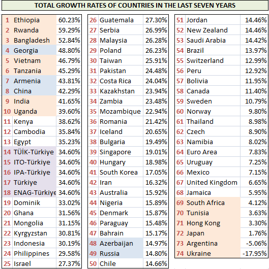
     We see this success of Georgia and Armenia in the countries’ total growth figures over the last seven years. Georgia has grown by 49% and Armenia by 44% in the last seven years.

     The top ten countries include South East Asian countries such as China, India, Vietnam, Bangladesh, as well as Middle East African countries such as Ethiopia, Rwanda, Tanzania, and Uganda. The face of Africa has begun to change rapidly in recent years.

     Look at the chart of Rwanda, which is in second place. The red colored real value curve has not yet bowed its head. This shows that no great success has yet been achieved in increasing the collective welfare of its people. However, the market value of the dollar is 126% above its real value.

     In the chart of Bangladesh, which is in third place, we see that while the market value of the dollar has continued to climb for the last year and a half, the real value curve has finally bowed its head. If the real value curve maintains its position, the upward trend in the market value will also stop and much more positive developments can be achieved in the country's economy for the benefit of the people.

     Bangladesh is one of the poorest but fastest developing countries in the world.

     Look at the chart of Vietnam. The market value of the dollar has continued to rise for the last fifteen years, but the real value of the dollar has now bowed its head and the difference between them is growing. This difference is currently at 97.5%.

     You see that devaluing the national currency is not a coincidence in achieving economic success and increasing the welfare of its citizens, right?

     Look at Uganda. There is a similar picture here. The market value of the dollar continues to increase, albeit with very small values, but the real value of the dollar has been in decline for the last ten years. In other words, Uganda's economy has been in a better position than the economic performance of the US for the last ten years.

     In terms of the total growth rates of countries in the last seven years, Turkey is in 14th place but this isn't much likely believable.

     In terms of the last one-year growth rate, Turkey is in 47th place with a ratio of 2.45%. Argentina, Jamaica, and New Zealand have shrunk. The growth rates of Europe and England are below 1%.

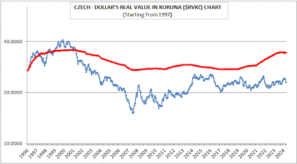
     The Czech Republic's growth rate is 1.45%. The growth rate for the last seven years was also low, 8.90% and the country is ranked by 62nd level. We can also understand this situation from the upward slope of the real dollar curve for the last seven years. And recently, the gap between these two curves has reached to -50%.

     The Czech Republic's export figures are actually above its import figures, but the ratio of its current deficit to national income has exceeded 5%. With the advantage of being a member of the European Union and of course being a country governed by the rule of law, it finances its current deficit with direct foreign capital inflows.

     The growth figures of Saudi Arabia and Bahrain are not very high either, but they have had extremely stable economies for the last forty years.

     The first chart above is Saudi Arabia's. The second chart below is Bahrain's.

     You can see how the value of their currencies is fixed to the US Dollar. The real dollar values ​​in red color are declining. In other words, they have a more successful economy than the US.

     Among the countries that have grown at the fastest pace in the last year, just like in the last seven-year period, are countries such as Rwanda, Ethiopia, Georgia, Vietnam and Uganda.

     Cambodia is in the seventh place. This country has also pegged the value of its currency to the US dollar. The real dollar value in red continues its rapid decline, thus the Cambodian economy continues its stable growth and the welfare of its people increases.

     India is a country that provides high growth rates. It is even said from time to time that it is on its way to becoming the second China. However, when we look at its chart, we see that this is not the case. India continues to reduce the market value of its currency in order to gain a competitive advantage. However, the real dollar curve in red is also increasing at approximately the same rates. In other words, it is not yet possible to speak of a real and publicly reflected economic success. However, this situation may change in a few years. Signs of this devolopment are also being observed.

     The Philippine economy is much more successful. For the last decade, the market and real values ​​of the dollar have been accelerating in opposite directions. This chart is a definitive proof that the increase in the market value of the dollar does not necessarily lead to an increase in inflation.

In our current table, we see the total inflation rates of the countries over the last seven years.

     Argentina is in last place with a rate of 6679%. It is followed by Turkey and Iran. According to ENAG inflation data, the total inflation rate for the last seven years is 2624%. On the other hand the average total inflation of Türkiye is 1187%. In other words, life in Turkey has become seven to twenty-seven times more expensive in the last seven years, according to different institudes those reveal inflation datas.

     The current table shows the inflation rates for the last year. Turkey and Argentina are again in last place. Countries such as Nigeria and Iran follow. Ukraine, which is at war, has 14% inflation, and Russia has 10% inflation. Georgia's inflation is 2.83% and Armenia's is 2.91%. Israel's is 3.24%.

      China's and Indonesia's inflation is negative. In Indonesia, living has become 0.42% cheaper in the last year.

     We see the reason of this success in the Real Dollar Value charts. In the last fifteen years the market value of the Indonesian currency has been increasing although it has stayed flat in the previous fifteen years. This development did not increase inflation and only regressed the Real Dollar Curve. In this way, the marketing of Indonesian manufactured goods provides a competitive advantage, and in this case, it strengthens the economy and increases its citizens welfare.

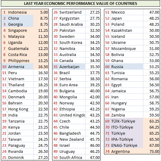
     The table below gives the economic performance values ​​of the countries in the last seven years. The lower the number, the more successful it is. China ranked first with 3.75 points. It is followed by South East Asian countries and Middle East African countries. Armenia, Israel, Indonesia, South Korea and Georgia are the other countries in the top fifteen countries. Turkey is in 63rd place with its hormonal growth process and truncated inflation process.

     Azerbaijan is in 58th place. After the strong devaluations in 2014, 2015 and 2016, the values ​​of their currencies have been pegged to the US dollar in recent years. However, it seemed that they encounter some difficulties to meet the necessary requirements so the Real Dollar Value continued to rise. Moreover, this momentum has been increasing in the last two years. Perhaps the market value will fall below the real value this year and this will cause Azerbaijani currency to a new devaluation.

     In our current table, we see the economic performance values ​​of the countries in the last year. While China has fallen to second place in this list, Indonesia has risen to first place. Argentina is in the last place and Türkiye is in the second worst place.

     In the last table below, we are monitoring the impact of currency devaluations on the economic performances of the countries.

     On the left row of countries there is the economic performance rankings and on the right row of countries there is the Real Dollar Value rankings. Except for the colored countries, these two lists are in harmony with each other.

     The reasons of the deterioration in the harmony of the colored countries may be as follows:

     The yellow colored ones are the majority countries that can be considered to report lower inflations and higher growth rates on a large scale.

     Denmark and Switzerland, marked in purple, are countries with strong and highly convertible currencies.

     It can be said that Israel and Armenia, marked in green, receive high levels of foreign support in terms of aid and investment.

     Bolivia and Guatemala, in light blue, are countries that have pegged the value of their currencies to the US dollar.

     Look at the Denmark chart. Since the market value of their currencies started to rise, their real dollar curves have also started to decline. Their economy was not this successful before.

     We finish with the Kenya chart. They were not performing very well because their currency had low convertibility and the market value was below its real value. Due to the strong increase in the market value of their currencies in the last five years, their real value dollar curves, marked in red, have finally started to decline.


3/13/2025

The Real (Intrinsic) Value Of Euro Dollar Parity (€RV$) - March 2025

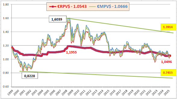
     Today, the Market Value of the Euro/Dollar parity(€MV$), is 1.0666, while the Real Value of the Euro/Dollar parity(€RV$) is 1.0543. There is only a 1.17% difference between them.

     The current equivalent of the lowest value of -26% seen in May 2001, or the minimum value to which the Euro/Dollar parity can fall, is 0.7413.

     The current equivalent of the highest value of 32% seen in June 2008, or the maximum value to which the Euro/Dollar parity can climb, is 1.3914.

     Our second chart shows the highest and lowest market values ​​along with monthly closing figures.

     The thick red curve shows the change in the Real Euro Value. This curve has been in decline for 17 years since 2008. The process that started from the peak of 1.1955 in June 2008 saw its lowest value of 1.0496 as of October 2024.
     The reason for this downward trend in the Real Euro Value is that the European economy is showing a weaker trend compared to the US economy. As a result, the Euro is weakening and European citizens are experiencing purchasing power losses.

     Our last chart gives a picture of the range in which the Euro/Dollar parity may move in the near term.

     If a similar decline occurs as in September 2022, the EURUSD parity may see a minimum of 0.9138.

     If a similar increase occurs as in January 2021, the value of 1.1930 will be a significant resistance.

     Today, the real and market values ​​of the EURUSD parity are almost equal to each other. Developments in political and economic processes will determine in which direction this movement will strengthen in the coming days.

     Of course, technical examination through charts will also be important. We are exactly at the midline of the green support and resistance curves these days. In case of downward or upward breaks, movements towards the 0.9138 or 1.1930 levels mentioned in the previous chart may accelerate.


3/11/2025

Total Market Value of "SILVER" and Weight of "PAPER SILVER"

     Today, the total market value of all physical silver mined since the beginning of history is around $1.84 trillion. The total market value of Bitcoin is even higher at $1.92 trillion. When we look at the total market value of all silver, we see a market of $3.24 trillion.

     Silver seems to be far behind, right? But that's not the real situation! Because just as cyrpto coins are virtual assets, silver also has virtual, or paper assets. And this is not an insignificant amount!

     In January 2025, the ratio of paper silver to physical silver was 380 to 1. In February 2025, this ratio decreased by 0.43% to approximately 1 in 378.5.

     When we take this paper silver into account, the total value of money invested in silver increases to $698 trillion. According to the fact of this huge volume, Bitcoin falls to 2.7 per thousand, while all coins fall to 4.6 per thousand. In other words, cyrpto coins are still far from replacing silver and gold.

3/10/2025

US Inflation Adjusted Silver Resistances

      In the logarithmic scale chart below, which started in January 1983, it is seen that when inflation adjustment is applied, the bottom level in November 2001 rose to 7.44 and the peak in April 2011 rose to 70.50. Today, silver is around $32.93.

     Our second chart is the US Inflation Adjusted Silver Chart, which was created with a logarithmic scale again from the beginning of 2016. The last bottom level, that is March 2020's 14.26, indicates a recovery above the previous bottom level of 12.63. The last peak of $35.97 in February 2021 is silver's first target in the upward direction.

     After this point is exceeded, the nominal peak of 49.54 in April 2011 will be targeted. When the US inflation adjustment is applied to this value from 2011, the value seen in the graph is 70.50. This will be the third target for silver.

     We will see that this level of 70.50 dollars will continue to increase with the US inflation that will occur in the coming years. In fact, the peak of inflation-adjusted silver was 70.39 dollars in January. In parallel with US inflation, there was an increase of 11 cents in one month. Therefore, when we think about the next few years, it can be said that a level equal to our previous estimates of 80-90 dollars can be reached. For this reason, the backward US inflation-adjusted silver graph is one of the most important graphs that we need to follow.


2/26/2025

"SILVER" and "US Dow Index" Earnings Comparison

     In the logarithmic scaled chart starting from 1983 below, the blue silver curve in the left column is compared with the black Dow Jones Index curve in the right column. There was a 10-fold difference in scale between gold and the Dow Jones Index; if you pay attention to the left and right columns of the chart, you will see that there is also a 1000-fold difference in scale between silver and the Dow Jones Index.

     At the beginning of 1983, silver had a 12.88 times higher return than the Dow Index. Then in February 1996, their returns equalized and until January 2006, the US Dow Index surpassed silver in terms of return.

     Then, as of April 2001, the return of silver rose to 4.10 times higher than the Dow Index return. Today -pay attention to the last part of the chart- the black Dow Index curve is 34%, i.e. 1.34 times, above the blue silver curve.

     On my previous post I showed that silver could rise to $85 by the end of 2027. Now, according to this chart, it could be said that, if the Dow Jones Index falls to 36,500 and the return of silver first catches up the Dow and then exceeds it by 1.5 times, the ounce price of silver could reach $55.

     Let this be our second prediction.

     My third prediction is on the following chart. This is the Silver/Dow Index Ratio Chart. In circles 1-3-5, silver and Dow Index returns were equal. In circle 2 dated May 2001, the Dow's return was 2.59 times higher than silver. In circle 4 dated April 2011, the silver return was 4.10 times higher than Dow. Now, it's time to make my final prediction that is shown as in circles 6 and 7.

     According to my second prediction, if the Silver/Dow Index Ratio become 1.5-fold in favor of silver, this could push the silver price to $55.

     Similarly, if the Dow Jones Index remained at 45,000 and the Silver/Dow Index Ratio rose to 2.00, then the silver price could reach $90.

     These are reasonable, not exaggeratted targets. What do you think?


2/25/2025

"GOLD" and "SILVER" Price Predictions

     In this chart the trend lines are extended to January 2028. A sixth-degree polynomial is used here. If such a realization occurs, this chart shows us that gold could rise to $5,750 and silver to $75 by the end of 2027-early 2028. Of course, the trend could follow a different path, and the process could present a very different picture. Here, we are only making a mathematical inference based on the data.

     Mathematics is infallible, but the process may necessitate different mathematics.

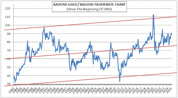
     Indeed, the chart below shows us such a possibility. You must have noticed the upward trend in the Gold/Silver Ratio Chart created from the beginning of 1983 to the present. While the midline of the Gold/Silver Ratio was 61 at the beginning of 1983, today this midline seems to have risen to 75. In other words, in terms of averages, gold is approximately 23% more valuable than silver compared to 42 years ago.

     I mentioned it in one of my previous publications. Now it is time to repeat it: The date when the Gold/Silver Ratio was first determined coincides with the Roman Empire. At that time, the gold/silver ratio was 12:1. In the early twentieth century, it rose to 40:1. Later, we see that at first 60:1, and today 75:1 are valid. I expect this ratio to reach its peak of 100:1 in the coming decades. Of course, this is not something that can happen overnight, it is a prediction that can happen around 2075.


2/24/2025

"GOLD" or "SILVER"? Which One Provides More Profit and When?

      The chart below shows the course of gold and silver valuations since the beginning of 2020. In the chart, black represents gold and blue represents silver.

     The section marked with the number 1 indicates the bottom level in September 2022 for both gold and silver, and the section marked with the number 2 indicates the peak valure in May 2024 for both.

     In the section from 1 to 2, gold increased by 51.77%, while silver gained 85.18% in the same period. In other words, the return of silver was well above gold.

     In the section from 2 to 3, that is, from the peak in May 2024 to the present, gold increased by 19.98%, while the increase rate of silver remained at 1.31%. Therefore, the difference between gold and silver in terms of return is closing.

     Now I will give you a very important tip. Note that there is a 100-fold difference between the scaling in the left column showing the silver price and the scaling in the right column showing the gold price. When the black and blue curves in the graph approach each other as if they are about to intersect, that is, when the gold price increases to around 100 times the silver price (sometimes this remains at 95 times, sometimes it can reach 115 times), in such cases, silver usually makes a reaction jump in a short time and the blue curve widens difference with the black curve again.

     We can also follow this situation in a much wider time range in the logarithmic scaled graph created since the beginning of 1990. As you can see, the blue silver curve is generally above the black gold curve. However, in some cases, these two curves come close to each other. In the period following this convergence, silver performs better than gold.

     Of course, there is an easier way to follow this correlation. The Gold/Silver Ratio chart provides us this opportunity.

     If you recall from the previous chart, silver had widened the gap between gold and silver in April 2011 and reached its peak value. Since that date, gold has gained more. This situation is shown with the orange arrow.

     It is possible to roughly divide the chart into three. When the Gold/Silver Ratio is between 30-60 gold and when it is between 75-115 silver are more advantageous in terms of performance. Today, we are at 89.26.


2/23/2025

Gold Pricing in Terms of Dollar Emission and US Debt - February 2025

      The printed US dollar, that is, the amount of emission, and the US National Debt have a direct impact on gold pricing.

     Dollar emission, that is, the amount of dollars printed, peaked at $21.72 trillion in April 2022. When the process that started with the pandemic caused high inflation, the FED raised interest rates and withdrew $1 trillion of the dollar stock spread around the world. And in October 2023, dollar emission decreased to $20.69 trillion.

     After this date, the emission volume started to increase again and now it has almost returned to the amount of emission in April 2022. The emission amount at the end of December 2024 was $21.53 trillion.

     There is a direct relationship between dollar emission and gold price. Regardless of market movements, when emission increases, the gold price - on average - increases at approximately the same rates.

      Especially if market movements also support the gold price, the ratio of gold to dollar emission also increases. The graphical examination of this ratio is extremely important in terms of estimating the gold price.

     As you can see, today the gold price is at the level of 0.136 of the US emission volume. When gold increases, this ratio also increases. In this parallel, I think that the 0.200 level seen in September 2011 will be seen again.

     In fact, when evaluated for a later date, an increase to the range of 0.300 to 0.400 may be experienced. The first graph showed the period after 2000. The starting date of this graph is 1978.

     Another important indicator for gold prices is the level of the US National Debt. Just like the emission volume, this also constitutes an important data package. Today, the US national debt is at the level of 36.22 trillion dollars, a figure much higher than the dollar emission.

     There is a similar relationship between the US National Debt and the gold price as the emission amount, but in some periods one can be at higher levels, and in some periods the other can be at higher levels.

     You can follow the course of the last fifty-five years from the table. Pay attention to the Gold/Debt Ratio in the last column. The bottom level was reached in 1980 at 1.32. In other words, the price of gold climbed to its peak against the US National Debt on this date. In 2000, we see that it reached 20.40, meaning that gold was a very cheap commodity at the beginning of the new millennium.

     An increase in the Gold/Debt Ratio means that the price of gold is getting cheaper, and a decrease means that it is getting more expensive. Today, we are at 12.45. It is certain that gold has risen compared to two years ago, but the Gold/Debt Ratio still maintains its high level. Therefore, it can be said that there is still a wide area ahead of us.

     In this context, I will finish by making additional predictions for the end of 2027. You can see these in the last three lines.

     If the ratio of gold to the US national debt falls to 10% by the end of 2027, this will mean a price of at least $5,270 for the price of gold. Especially if this rate drops to 7.5%, the ounce price of gold will rise to 7,027, and if the rate drops to 5%, the ounce price of gold will rise to 10,540 dollars.

     These figures are more than just predictions, they are conditional propositions. Just like "if this happens, this will be the result".

     Stay tuned. Best wishes...

2/21/2025

US Inflation Adjusted Gold Chart - February 2025

      In the logarithmic scaled and US inflation corrected chart below, starting from 1972, pay attention to the double peaks dated January 1980 and September 2011.

     After the movement in the last month and a half, we see that this double peak has finally been definitely exceeded and the level of $2,930 per ounce has been reached. The first target after this will be $3,000.

     Our second chart is the large-scale version of the previous chart, not logarithmically scaled and created from 2006 to the present.

     After the last rise, we can see how the previous peaks were exceeded much more clearly from here. Just like the bottom points from $1,398 to $1,720 were formed higher, I expect gold price to continue climbing to a new peak higher - before a respitation. In this context, I believe that the levels of 3,300 can easily be seen in the gold price in the period until mid-2025.


2/20/2025

Gold/Dow Jones Ratio (Gold's Real Value Indicator)

     In the logarithmic scaled graph below, the price changes of the Dow Jones Index and gold metal from the beginning of 1972 to the present time can be monitored simultaneously. The black curve shows the ounce price of gold, and the blue curve shows the Dow Jones Index.

     While gold and Dow Jones returns were equal to each other in the 2nd, 4th and 6th green circles, gold had a higher return in the 1st and 5th circles and the Dow Jones Index had a higher return in the 3rd circle.

     The first circle shows the situation in September 1980. Here, the return of gold had exceeded the return of the Dow by 6.80 times. In the third circle, in January 2000, the return of the Dow exceeded the return of gold by 4.15 times. In the fifth circle, we see that gold once again made a higher return and exceeded the Dow Jones return by 85%, that is, by 1.85 times.

     After the 6th circle, where the Dow Index and gold ore returns were equalized, the Dow Jones Index managed to provide more returns than gold. Today, the difference between them is 1.53 times in favor of the Dow Jones Index. In January, there was a difference of 1.62 times. In other words, gold is on its way to catching up with the Dow Jones Index in terms of return.

     I would like to make my first prediction about the future price of the gold on the graph above. I think that the return of black painted gold curve will first catch up the return of the blue painted Dow Jones Index curve until 2027, and then exceed it by at least 1.5 times. In this context, I expect the Dow Jones Index to fall to levels of 36 thousand and the price of gold to rise to around $5,500.

     Pay attention to the gold scaling in the left column and the Dow Index scaling in the right column. There is a 10-fold difference between them.

     Now it is time for our unique and beautiful graph, which I love very much. Here we have compared the returns of gold and Dow Jones Index to each other. The circles marked 1-7 are in harmony with the previous chart.

     Circles numbered 2-4-5-6 show the periods when Dow and gold returns were equal or close to each other. In circle number 1, gold had higher returns, while in circles number 3 and 7, Dow Index had higher returns.

     Going below the zero line shown in orange color means that Dow Jones Index return is higher. Going above it shows that gold return is higher.

     I am making my second prediction in the last chart below which I extended to 2027.

     In my first prediction, I expressed my expectation that the Gold/Dow Ratio would rise to 1.50 and the gold price would reach $5,500 within this scope. My second prediction is that, for a slightly more distant future, gold return could exceed Dow Jones Index return by 2.0 times. If this happens, the Dow Jones Index will be around $45,000, while the price of an ounce of gold could reach $9,000.


Warning

Warning